In a world… where Chuck E. Cheese tokens are legal tender

typed for your pleasure on 9 April 2016, at 1.42 am

Sdtrk: ‘Date night’ by Will Yates

My satisfactory job excels in many ways — I often will tell anyone within earshot that it’s the best job I’ve ever had. The only downsides are that
1) the drive to and from work is lengthy (roughly 25min there and about an hour back, under normal circumstances), and
2) it doesn’t involve me closely inspecting Synthetik girlfeet for eight hours a day. But then, if we had everything we wanted, we’d be spoiled. I say that a lot, too.

However, to take my mind off the first issue, I’ve begun revisiting the distracting wonder that is the podcast. I’m not going to list my favourites here, as I intend on covering that in a future post, but I’m more than halfway through a series entitled ‘Germany: Memories of a nation‘, available from BBC Radio 4. Over the course of thirty episodes, host Neil MacGregor discusses various points concerning Deutschland’s geographical and social history, which is actually more fascinating than it sounds. True, some episodes are a bit boring (‘The Battle for Charlemagne’, for example), but others are really fascinating, like the one detailing the Bauhaus school of design, which I’ve always been intrigued with, and the one focussing on Notgeld. Now I want to buy some godforsaken Notgeld, cos obviously I need more ephemera in my life and to add to my rapidly-filling flat.

‘What’s Notgeld?? What the hell is it??’ you shriek, eyes wide, mouth frothing at the corners. Ah, I can sense that you are intrigued! First, a high-speed primer as to the situations which caused Notgeld to come into existence.
During World War I, Germany’s economy was sliding rapidly down the toilet, as the cost of the war effort was bringing about inflation. It kicked into high gear in 1922, where things were so bad that the Deutsche Mark would lose value over the course of a week. You’d have people getting their paycheques, and immediately racing to the shops to spend them before they were near-worthless. When this happened, which was often, the banks would issue new notes of higher value. Eventually it got so that the more notes there were in circulation, the less they were worth — which is where you get those anecdotes in history books of citizens literally bringing in wheelbarrows filled with Marks into shops, just to purchase groceries — and at any rate, the banks couldn’t afford to keep printing them.

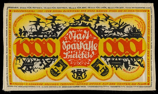
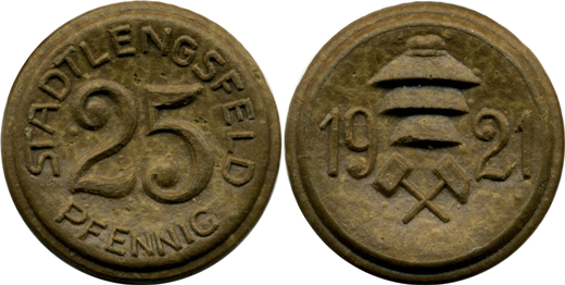
The solution, then, was Notgeld, which is German for ‘necessity money’. It was defined as the currency that institutions would issue during economic or political crises, mainly when the national bank was out of regular money. These were issued not only by the national banks, but also by the banking institutions of various towns and municipalities. Of course, since metal was in short supply due to there being some sort of ‘world’ ‘war’ taking place, a lot of the denominations were printed on paper. Even then, issuers would get fancy, due to lack of overall materials, and would design notes made from silk, or leather, or postage stamps, or porcelain, or my favourite, compressed coaldust.


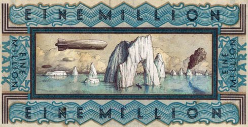
Zeppelins and icebergs, always awesome


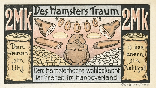
‘The Hamster’s Dream’. Anything with a hamster on it is automatically great. Although he looks a bit sinister


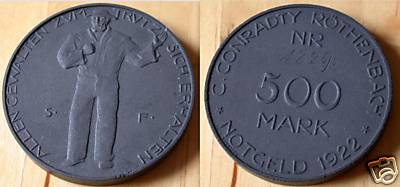
This is one of the coal coins. I can’t imagine them doing a person’s pockets any favours. Because of the dust, not because you have money, you see. Quit your bitching, at least you have money. And stop licking your fingers


A Notgeld made of linen. Like a tea towel, that… you can use… to buy actual tea towels with


Porcelain coinage


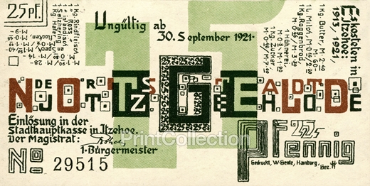
This one, designed by Wenzel Hablik, really speaks to me. Not only does it have a very cool, Ray-Gun-magazine-filtered-through-Bauhaus look to it, it’s a document of the economic situation that created it. Part of the text lists how much average things were in Itzehoe, the town it was issued in, in 1921

Vertical Text in top right corner: “It costs in Itzeohe in 1913 / 1921 1 Kilo Butter: 2.40 Marks/60 Marks 1 Liter Milk: 16 Pfennigs/2.80 Marks 1 Kilo rye bread: 46 Pfennings/3.30 Marks 1 egg: 8 Pfennigs/1.90 Marks 1 Kilo sugar: 48 Pfennigs/ 7.60 Marks”
Text in top left corner: “1 Kilo beef: 1.90 Marks/28 Marks 1 Kilo horsemeat: 80 Pfennigs/14 Marks 1 Kilo domestic bacon: 1.5 Marks/40 Marks 1 Herring: 6 Pfennigs/1.40 Marks 1 Kilo oatmeal: 48 Pfennigs/9 Marks”

Not only were they in demand cos they were, y’know, legal tender, but the uniqueness of the designs encouraged interest and use. Many towns depicted scenes on the notes or coins related to their history, or associated with their industry.


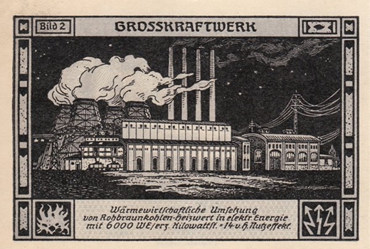
Such as this one from Bitterfeld, showcasing a power plant…


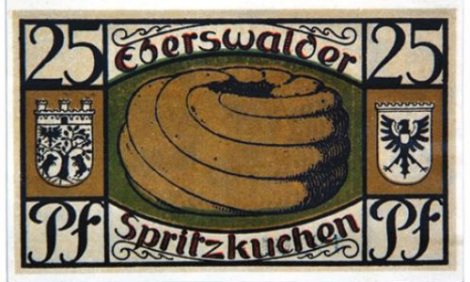
…or this one from the town of Eberswalde, known for its delicious all-pastry tyres.

Admittedly, my super-rudimentary knowledge of German had me initially thinking Notgeld meant ‘Not money’, but unsurprisingly, I was wrong.

You’ll be pleased to know that if you really want to own examples of Notgeld, eBay has a shedload of reasonably-priced ones on offer. I mean, I’m doing my damnedest not to buy this set, as its German Expressionist design speaks to me. I’ll note that the paper ones are easiest/cheapest to find — if you’re going to aim for hardcore status and attempt to purchase some of those compressed coal ones, you’ll find that examples of those are quite rare, as a good number of those were used as fuel. Still, there are worse hobbies! You can’t make your own Notgeld to buy the vintage Notgeld with, however; it doesn’t work like that

Random similar posts, for more timewasting:

Looking backwards is looking forwards on February 23rd, 2013

All you really need is one wheel on November 16th, 2007


A cruise, improved

typed for your pleasure on 17 August 2014, at 7.52 pm

Sdtrk: ‘Island of birds’ by Sven Libaek

As periodic readers of ‘Shouting etc etc’ are already aware, there’s not a single thing that I like about the annual Woodward Dream cruise. I’ve mentioned why before, so I’ll not go on about it again if you’re a new visitor; you are welcome. One of the main issues that I have with it, apart from the fact that the event hampers the mobility of local non-participants, or the lack of logic of taking part in such an event when regular petrol is hovering just under $4 a gallon, is that the cars are large, ungainly, and mostly unsightly. Sorry, klassic kruisers, your cars are simply too goddamned big. The only exception to that aesthetic choice would be the 1970 Plymouth Superbird, as it is so comically overproportioned it’s awesome. And classic hearses; you can’t go wrong with those, either.

In making my way down Woodward earlier last week on the way home, I’d seen the safety orange advisory signs bolted to normal traffic signs, reminding people that the week-end of the 16th would be taken over by the Nightmare cruise. What if, I thought to myself, what if all those giant landboats were replaced with smart little classic foreign autos instead? Well, for one, I’d be out on the sidewalk every year, taking footage of the endless stream of European and Japanese cars. Cars such as


the Alpine A110


the Citroën 2CV


the BMW Isetta


the Jaguar E-type


the Toyota Sports 800


the Messerschmitt KR200


the Studebaker Avanti (yes, I’m well aware this is an American vehicle, but it gets a pass)


and the Subaru 360, amongst others. And although I’d fully expect to see both the modern and classic versions of the Fiat 500, the MINI, and the Volkswagen Beetle is that those selections are pretty much a given.
And since ‘classic’ is a loose descriptor, I’d get some automobiles from the glorious Eighties in there as well.


the Citroën Karin Concept, from 1980


the Renault Fuego (I have a soft spot for these, as it was the third car my parents ever had)


the Toyota TAC3 Concept, which looks an awful lot like the Livecougar, the jeep from Chojuu sentai Liveman


and you can’t properly represent the Eighties without some DeLoreans in there. And I’ve noticed that two of the four cars I’d just listed never made it into production. Huh.

This new, more Continental/Japanese-flavoured Cruise would also have allowances for relatively modern cars with retro styling, such as the Nissan Pao, the Nissan Figaro, or the Mazda Autozam AZ-1. In a lot of ways, modern cars with classic appearances combine the best of both worlds: they don’t have the generically bland ‘style’ of contemporary vehicles, but they possess features that older cars didn’t have, such as power steering and air conditioning.

Micro- to mid-sized cars are fantastic! They take up very little space, and more importantly, they don’t scream to the world that you’re making up for some other, more personal, shortcomings! And really, I’m not what you would describe as a ‘car guy’. Meaning, I don’t give a toss about torque, or horsepower, or technical details such as that. I like the cars that I like due almost strictly to their aesthetics.
There’s a whole bunch of cars I’d not mentioned, as I didn’t want this post to be as long as the cruise it would describe. But would you have a make and/or model of car you’d like to see in the improved Dream cruise? Why not mention it in the comments below?

Random similar posts, for more timewasting:

Fusing Materialism with Esoterica on September 4th, 2007

All you really need is one wheel on November 16th, 2007


This was the Future, Vol.44

typed for your pleasure on 29 September 2010, at 12.07 am

Sdtrk: ‘Milling around the village’ by Broadcast

Sweet Dagon, the last one of these I wrote was in April?? *exhales* Wow. Good job I don’t charge admittance to read this blog, right? Yeah. Whooo.

Anyway! This house, like all good dwellings, has a name; they call it Moonacres. Which sounds really Crowleyan, if you stop to think about it. Adding to its pre-20th century Modern pedigree would be the fact that it’s located on the Beaulieu Estate, in Hamster Hampshire, England. According to its listing on The Modern House Agents (yes, I’m harvesting from them again), ‘The Estate is an area of approximately 7,000 acres of beautiful Hampshire countryside, including the Beaulieu River, that is owned by Lord Montagu. The Estate has been in existence since the 13th century and has been carefully protected to avoid over-development’. Mm hmm.

The house itself, designed in the Sixties by architect John Strubbe, boasts two floors, five bedrooms, an office, a study, a reception room, and a double garage. There’s a deck area over the garage as well, so you and your significant other / mistress / what-have-you can lounge about, drinking Bradfords and staring off into the middle distance.

The only issue I have with this place is rather like the one that fellow bloggist veach of s n a p p e r h e a d had with the domicile I’d written about in the previous instalment of this series — Moonacres’ interior is kinda incongruous with its exterior. It’s been maintained, so it’s not as if it’s falling into disrepair or anything; it’s just too modern. Like a now modern, not a Sixties modern. I love IKEA and all they do for humanity, but its distinctive aesthetic simply doesn’t belong in a home from roughly fifty years hence. Although I gotta say — the white, black, and Factory grey with blood-red colour scheme they’ve got going definitely speaks to me.

You’ll be delighted to know that Moonacres is still on the market for a cool £1,750,000, so start rooting through your couch cushions

Random similar posts, for more timewasting:

This was the Future, Vol.43 on April 18th, 2010

This was the Future, Vol.18 on November 10th, 2005


This was the Future, Vol.43

typed for your pleasure on 18 April 2010, at 7.36 pm

Sdtrk: ‘Electric seance’ by Pram

Next time you happen to find yourself southwest of central London, Engerland, why not make a detour and visit the town of Frimley? I was going to say ‘make a brief detour’, but after spotting this beauty, it’s odds on that you’ll be there for a while.

Designed in 1966, the house contains three bedrooms, a reception room, a kitchen / breakfast room, a courtyard, and a single garage. But there’s only one bathroom for all three floors?? That’s probably going to cause more problems (read: fistfights) than it’ll solve.

What I particularly like about the property is that the exterior resembles some sort of futuristic Modish castle; that’s undoubtedly due to the half-circle windows and the cylindrical whatever-the-hell-that-is on the front of the building. When you think about it, it kinda fits, though; after all, what do they say a man’s home is?

It’s ace in and of itself that a house like this exists, but even more fantastic is that there’s actually a group of houses that all look like that — thirty-two, in fact, all in the same neighbourhood. And as I’d found this place as a listing on The Modern House Estate Agents, you’ll be interested to know that it’s currently under offer, so although it may be bought or rented out soon, on the other hand, it may not. And does that offer apply to all thirty-two of the buildings? Cos that’d be a hell of a deal

Random similar posts, for more timewasting:

This was the Future, Vol.24 on April 15th, 2006

This was the Future, Vol.10 on April 17th, 2005


This was the Future, Vol.17: supplemental

typed for your pleasure on 12 December 2009, at 6.38 pm

Sdtrk: ‘Modern cinema’ by The Summer Hits

Here’s a neat little follow-up: Vol.17 of this series spoke about the glass-and-concrete space phallus known as the Post Office Tower — which is nowadays called the BT Tower, after its current owners, British Telecom — located in London’s West End. As previously mentioned, one of its selling points was a restaurant at the top of the tower, bizarrely named topofthetower. It operated to great amounts of success until 1971, when it was closed to the public after an IRA-made bomb exploded in the mens’ toilets.


100 Cool Points to anyone who can correctly guess where this still is from.
Hint: you’d have to be a Dodo to not know where it’s from, really

However! According to Retro To Go, BT plan to refit and reopen the tower’s restaurant to the public; their plan is to have it completed by December 2011, so that it can be ready and running in time for the 2012 Olympic Games in London. Nice! Although it’s more than likely not going to have similar fab 20th century Modern decor as it did thirty years ago, it’s good to see that one of London’s landmarks will get a new lease on life…

Incidentally, topofthetower was part of the Butlins conglomerate. Mr Butlins is known as the man behind the Butlins Holiday Camps, which were bargain-priced, chalet-based resorts located in various areas around England and Ireland, that provided entertainment and other recreational activities for holidaymakers. The site Butlins Memories has a fab page that has scans of the original topofthetower menu from the Sixties. Take careful notes BT, as that’s what you have to live up to

EDIT (01 JAN 2014): Why not check out the ‘Eating High’ segment of the Sixties-era ‘Look at Life’ film series? Finally, a video that hasn’t been yanked by YouTube! I say that now, of course…

Random similar posts, for more timewasting:

Transform and... double-park on May 31st, 2007

The Eighties are back! And THEY'RE COMING FOR YOUR EARS on February 6th, 2010


This was the Future, Vol.42

typed for your pleasure on 1 December 2009, at 12.29 am

Sdtrk: ‘Oh Odessa’ by Cluster

If you keep an eye on the cultural zeitgeists that come and go with each passing decade, you’ll soon come to the realisation that each decade doesn’t necessarily shift gears when the new one starts up. For instance, the Fifties didn’t really end until about 1963, and the Sixties finally lay down and died round 1974. During those transient years, you get some interesting stylistic collisions, much like Frith Hill, a fantastic house in Godalming, Surrey.

It was designed in the early Seventies, but it still has a very Sixtiesy look to it. Sure, it’s late Sixties, but it still counts. It’s the sort of house that would’ve fitted nicely into Kubrick’s ‘2001: a space odyssey’, had there been more scenes not actually taking place in space.

A spiral staircase, one of those crazy Swiss chalet-type fireplaces, wood panelling as far as the eye can see, four (count ’em) bedrooms, 1.5 baths, and two balconies? And the colour scheme is restrained but Mod, as well! This house is impressive. I’m impressed!
Although it’s been recently sold, you can still drool over its listing on The Modern House Estate Agents, as that’s the sort of thing they traffic in. Impressed!

Random similar posts, for more timewasting:

This was the Future, Vol.11 on May 27th, 2005

Dig my Future home of the Past in the Future on January 7th, 2005


This was the Future, Vol.41

typed for your pleasure on 5 October 2009, at 7.05 pm

Sdtrk: ‘Si vous connaissez quelque chose de pire qu’un vampire, parlez m’en toujours, ça pourra peut-être me faire sourire’ by Stella

Although it’s painfully obvious that I loves me some 20th Century Modern design, I do have to go on record here as saying that most of the Seventies was rubbish, as it was as if the worst parts of the Sixties were magnified. Disco, for example. Southern rock. Unnecessary pornstar sideburns and impossibly wide Starscream lapels. Avocado and goldenrod as legitimate colour choices. The list of atrocities goes on. Thankfully, though, the decade wasn’t a complete stylistic cesspit; personally, I’ve always believed that a decade’s overall zeitgeist never starts immediately upon the first year — the Sixties didn’t really end until about 1973, for instance. Plus, the Seventies thankfully brought us Punk and dystopian scifi films, so it wasn’t a complete loss. Overall, stylistically speaking, I’m more ‘Ashes to ashes‘ than I am ‘Life on Mars‘.
Where am I going with this, you may be asking in an annoyed tone? Well, 1971 managed to spawn another lost architectural gem — the Venturo prefab house, designed by Matti Suuronen.

The walls were double-skinned fibreglass with 2″ of polyurethane foam, and the floors were an insulated composite beam of marine grade plywood. The whole thing weighed just four tons and sat on 16 small piers. One module contained the bathroom, kitchen and sauna; the other shipped with the filler pieces.

Much like Buckminster Fuller’s Dymaxion House, the entire assemblage was built for easy on-site construction and breaking-down, should the owner wish to relocate, and much like “Bulle“ à 6 coques, the Venturo units were made for a variety of swinging Seventies recreational uses, such as a holiday home, a bungalow, a ski lodge, etc. Unfortunately, much like the Dymaxion House and the “Bulle“ à 6 coques, the idea just didn’t take off amongst the general public. Although, oddly enough, quite a few of the finished units were utilised in Finland as service stations for BP; one still stands, in desperate need of renovation.

Matti Suuronen was also the architectural mind behind another mod prefab structure, the Futuro House, which fellow iDollator Everard had once suggested I write about. Perhaps I shall! Perhaps I shall.

From the comments section on the site the article comes from:

Krissie says: I WANT ONE! But, I only have one question: Where is the bedroom?
dru says: Where ISN’T the bedroom?

This, then, is Seventies

Random similar posts, for more timewasting:

This was the Future, Vol.17: supplemental on December 12th, 2009

This was the Future, Vol.20 on December 22nd, 2005


« Previous entries