


None more black, until the next one
typed for your pleasure on 23 May 2025, at 1.00 amSdtrk: ‘Spiritual cramp’ by Christian death
Some of you may be vaguely aware that I had a brief but memorable stint as a technical director/telly personality on the self-described ‘infotainment show’ known as Half mask, courtesy of the public access class I took at Barden Cablevision Detroit during the early Nineties. Surprisingly, our programme even won third place for the network’s Best of the Best awards in 1993, and first place the very next year, but that’s neither here nor there right now. But I will still brag about it.
Anyway, I was asked along with the main host and one other person to attend the awards ceremonies to represent the show, but I decided that I’d paint my nails before doing so. However, instead of sensibly purchasing a bottle of Wet ‘n’ Wild #735A (‘Power Outage’) as I would begin doing on a regular basis later in life, I not only bought a pot of black model paint, but I’d completely overlooked the fact that it was matte black. Although I applied it to my nails regardless, it looked rather unusual… it put me in mind of Transformer-era Lou Reed, which is an act I had no problem following whatsoever.

You would’ve thought Angus MacLise would’ve been the first Velvet Underground member with painted nails
Then and there I’d come to the conclusion: gloss nailvarnish is the only proper choice for me, which is a statement I stand by to this day. Flash-forward to 2021, when Ursula Clarke, aka Dragonfly, aka Undead Barbie, finally saved up the appropriate funds to move into Deafening silence Plus. Much like everyone here except for our Dyanne, Ursula’s sartorial sense is Goth, but the specific flavour of Goth fashion she indulges in would be Nu Goth, and that sub-subculture really brought dull gloss black nails to the forefront. To be honest, I had no idea that dull gloss nailvarnish was even a thing until she told me all about it, and it’s a unique thing amongst unique things!
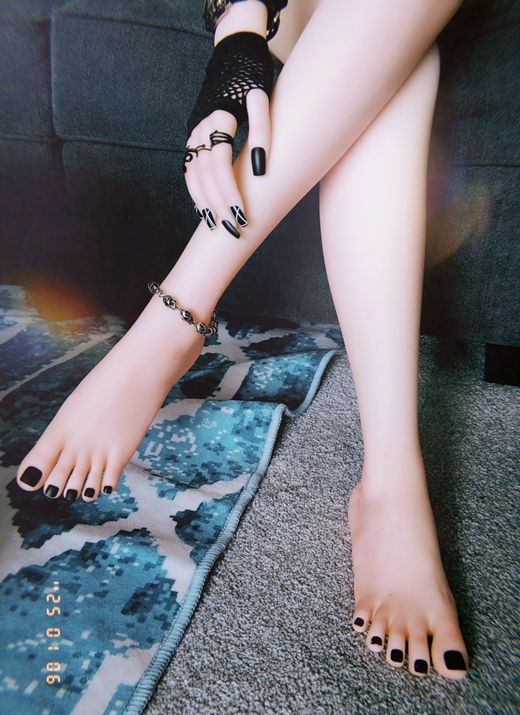
All of us here think of these as black candy
Gloss black presents a lovely reflective surface, whereas matte, by its very nature, absorbs light. The former is evocative of automobiles or PVC clothing, but the latter is the darkness of deep space in miniature. Which, all told, is one of the reasons Ursula paints her nails in dull gloss black. ‘It’s The Void, but fashion !’ she once commented. All three finishes have their uses, however.
There’s an internationally-acclaimed artist out there who lives and works in London, England, by the name of Anish Kapoor. If you’re at all familiar with that name and were wondering what exactly I was leading up to with my tale of nailvarnish errors, you can now take this opportunity to point at your computer’s monitor and go aahhh, but for the rest, I should probably explain.
Back around 2016, several news outlets, blogs, and sundry YouTubers discussed a Bold New Development in The World of Paint known as Vantablack, developed by the English company Surrey NanoSystems. Apart from being an amazing name for a roller derby contestant, Vantablack is, according to Wikipedia, ‘a class of super-black coatings with total hemispherical reflectances (THR) below 1% in the visible spectrum […] composed of a forest of vertical carbon nanotubes “grown” on a substrate using a modified chemical vapor deposition process. When light strikes Vantablack, instead of bouncing off, it becomes trapped and continually deflected amongst the tubes, absorbed, and eventually dissipated as heat.’ Which is crazy.
It’s… actually a wee bit terrifying. It’s like an ACME Portable Hole
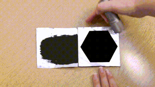
As riveting and totally mind-boggling the concept of Vantablack is, I’m going to pause here and talk a bit about Kapoor, to create narrative tension. Born in 1954 in Mumbai, India; relocated to England in 1973, and has been there ever since; originally in Liverpool, then with a move to London shortly after. He’s developed numerous architectural projects, as well as created stage sets for a few operas, on top of creating four decades’ worth of sculptures and installation pieces, plus being awarded the Turner Prize in 1991, but if you’re an American, especially one who’s familiar with downtown Chicago, Illinois, you’ll possibly have seen one of his more recent works either on telly or in person.
Your Humble Narrator and Euchre at Cloud gate, circa 2014. His head is normally that blurry, as his surname is Seurat
Cloud gate, or as too many people have dubbed it, ‘the Bean’, was completed in 2006, from 168 stainless steel plates that were welded together, and is 33 x 66 x 42ft (10 x 20 x 13m), weighing in at a tidy 100 tons. That’s the thing about Kapoor: a lot of his work consists of massive intimidating sculptures, and a fascination with reflective surfaces, bold colours, and voids. He is, as I understand him, a maximalist. Apart from being the polar opposite of minimalism, of course, maximalism is an expression of excess. More ornamentation than usual, larger proportions, overstatement rather than understatement, ‘more is more’. You know — like your average American. ZING.
Two excellent examples of maximalist architects would be Étienne-Louis Boullée, who I learnt of via the 1987 Peter Greenaway film ‘The belly of an architect’, and Albert Speer, who was famous for other, awful reasons. But if you look at either of their works, they’re characterised by a gigantic sense of scale; examples of two of Boullée’s would be here and here, and one of Speer’s is here. Even though both men had their sponsors, most of their proposals didn’t get far past the blueprint stage, as you can imagine, as they were just too feckin’ big.
On the other hand, Kapoor’s catalogue consists of these beauties, amongst others:
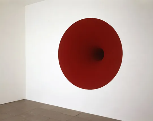
Untitled, 1995

Spire, 2014
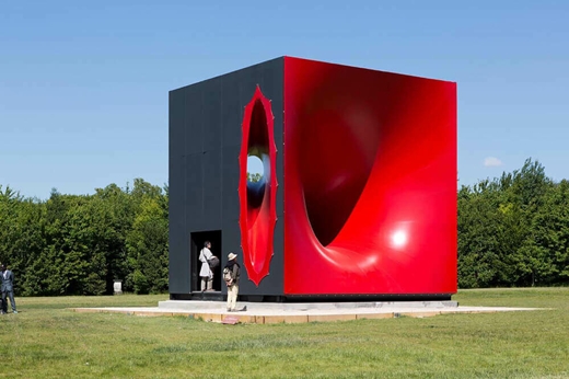
Sectional body preparing for monadic singularity (love that title), 2015
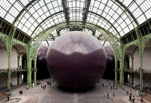
Leviathan, 2009
Honestly, a lot of his work strikes me as being really cool! The first, second, and fourth pieces remind me of the covers of Coil’s two album set, A guide for beginners: A silver voice and A guide for finishers: A golden hair. Unfortunately, though, Kapoor himself strikes me as really petty.
Around 2014, Vantablack S-VIS, which is the sprayable version of the paint, was exclusively licenced to Kapoor’s studio, meaning only he was allowed to access and use it. Understandably, many people in the art world were upset with this course of action, resulting in petitions and public complaints from other artists, to no avail. Kapoor dismissed all concerns with an attitude that’s very much ‘this is mine now, sucks to be you’. In response to his being a covetous shitfridge, competing artist Stuart Semple developed his own unique shade of paint. This is where we’re at now — response paint. The whole scenario is like a rap beef! Not wrapped beef, though; that’s mostly different.
So what’s the deal with Stuart Semple? A Dorset lad born in 1980, Semple’s dabbled in sculpture, paintings, and performance art, but more significantly, he has a much more egalitarian view towards democratising the tools that artists need. What that translates to is that he’ll make free (or significantly cheaper) versions of trademarked colours that would otherwise only have exclusive use by certain artists or companies. There’s International Klein Blue, the extremely rich shade of blue pigment developed and patented by Yves Klein in 1960; Semple’s made Incredibly Kleinish Blue. The corporation Mattel has trademark protection on Pantone 219 C, otherwise known as Barbie Pink; Stuart Semple offers you Pinkie. So far, I like this Stuart Semple chap! Plus, one of his hairstyles is just a sweeping wave of fringe, much like 1982-era Phil Oakey. Looks a bit like the musician and artist Momus, too, but Stuart has the use of both of his eyes.
Prior to Pinkie, however, the wrapped beef began when Semple learnt of Kapoor’s monopoly on Vantablack. In 2016, Semple released PINK, which he claims is ‘the “pinkest pink” paint available’, and in an effort to curtail Kapoor’s avariciousness, buyers of PINK had to sign a legal document when purchasing it which not only specifically excluded Anish Kapoor from buying some, but any of Kapoor’s associates as well. Things escalated, however, when not only did Kapoor obtain a jar of PINK in December of that same year, he followed up with a post on Instagram that underlined his level of mental maturity and classiness:
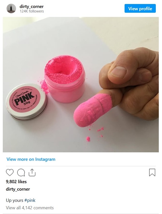
(Fear not, it’s only a screenshot, as I will never link to Instagram)
Yep. After that, Semple released the pigments BLACK 2.0 and BLACK 3.0, which are again, affordable paints… at least, I assume they’re affordable, as I’ve not bought paint since the Best of the Best Barden Cablevision awards ceremony, but I’m sure they’re much less expensive than Vantablack. Since then, Semple’s expanded his oeuvre to include other colours, plus he’s up to BLACK 4.0 these days, if you’re keeping score. Overall, though, the most amusing thing that’s resulted from Kapoor’s juvenile stupidity would be Semple developing a pigment called Diamond Dust, which is ‘an extremely reflective glitter made of crushed glass shards that are designed to hurt Kapoor if he dipped his finger in it,’ which is both fantastically petty, and entirely justifiable.
Now all of this Bay of Pig(ment)s-level (sorry) brinksmanship is a fascinating carcrash for those of us standing outside of it. However, the unfortunate thing is that Kapoor still has the exclusive rights to Vantablack, when all’s said and done, and I’m sure this decade-long feud only has him digging his heels in further.
One of Surrey NanoSystems’ competitors, Nanolab, headquartered in Massachusetts, have their own supermegaultra black paint, named Singularity Black, who I could’ve sworn was the lead singer of the Pixies. Originally created for NASA, Nanolab are being the better people in that not only have they made Singularity Black available for everyone, but for any artist who’s really interested in how to effectively use the paint, Nanolab are more than willing to share info and advice with them. Much like Semple’s BLACK series, a person can buy an artist’s sample — however large that is — for only USD$30. That’s nothing money! Which is appropriate, as you’re buying Nothingness.
Artist Jason Chase, who worked with Nanolab to basically exhibit Singularity Black, was quoted as saying,
‘It is important to create access so artists can use it,’ said Chase. ‘Artists are always the ones who take new materials and push them to new limits. Singularity Black is the perfect new medium to foster such experimentation and development across a global community. This super black paint and its possibilities have been stunted by not being available to experiment with. (emphasis mine) Starting with my work, those days are over.
I imagine Jason slamming his fist onto the podium with that last word, there. But it should go without saying that he’s right: some arsehole gains exclusivity to something new, innovative, and helpful, and progress in that field grinds to a halt. Thankfully in this case, it didn’t, as Nanolabs took over where Surrey NanoSystems failed. So while Singularity Black apparently isn’t quite as dark as Vantablack, it’s still as near as damnit, which means that ultimately, Kapoor’s just paid for the name. Hope it’s worth it, bunky.
I’m one of those people who believes that the words and actions that a person says or does are intrinsically tied to whoever said/made them, whether if it’s blatant, or if they try to spin it like ‘I just said those things cos I was angry; I don’t actually think like that‘. If you’re a venal, hateful human being, but you’ve created something that I previously enjoyed, eight times out of ten, I’ll stop enjoying what you’ve done, as I don’t want to tacitly approve of you being a fuckwit (e.g: Morrissey, Ricky Gervais, John Lydon, Terry Gilliam, and many others). I’m painfully aware that Organik humans aren’t morally black & white; some say the ambiguity makes humans interesting, but ‘interesting’ to me means ‘either good or bad’. It’d be nice if people were more cut-and-dried with their thoughts and personalities, as that’d make things astonishingly easier for everyone.
But my point, really, is that sometimes I have to wincingly separate the art from the artist with someone toxic such as Kapoor, much like how I dig the work of Gilbert & George, even though they’re pro-Brexit monarchists, and every time, it’s a struggle. Thankfully I don’t have the attachment to Kapoor’s work as I do with other artists whose work I’m keen on, but need to be shoved into traffic due to their morals. It’s some small solace to know that there are millions of people in the same quandary as myself; however, that doesn’t solve the root of the problem.
As much of a twat Kapoor is, one of the only decent things I’ve known him to do was file a lawsuit against the NRA back in 2018, as the organisation apparently used footage of Cloud gate as part of one of their pro-gun adverts, so that’s something. Again with the Organik human ambiguity: sues a hateful group of psychopaths for unauthorised use of his work in a pro-psychopath campaign one day; prohibits the use of what could be a boon to thousands of artists due to his greed the other. Ugh.
And that, dear readers, is a sterling example of how the modern art world is far too concerned about the monetary value of various works and the return on investment various artists are believed to have. Art should be viewed as a mode of expression first, a decoration second, and an investment never.
That statement really only peripherally applies to this post, but I still stand by it, and frankly, I couldn’t think of any other way to end this! You’re welcome
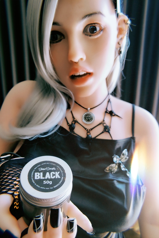
Told you it was affordable
Random similar posts, for more timewasting:
This was the Future, Vol.35 on August 16th, 2007
O, don't get my hopes up on September 11th, 2008