


‘Nie wszystko jest koszmarnym paliwem’
typed for your pleasure on 23 June 2025, at 1.00 amSdtrk: ‘It’s a fine day’ by Jane
FACT: There’s not a man, woman, child, or pet, who isn’t familiar with film posters, no matter what country you reside in. But there are few things out there that come aesthetically close to the Polish film poster, which is a shame, as they’re unique, eye-catching, and wholly original. Some of them are flat-out terrifying, but again, that just adds to their distinction. They are incredible, and you’ll be seeing a few examples here whilst I natter on about them at length, as is my custom. Be sure to click on each image to get a full-size view as well!
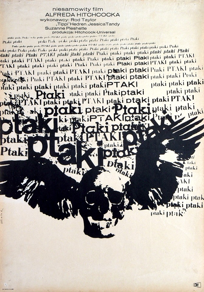
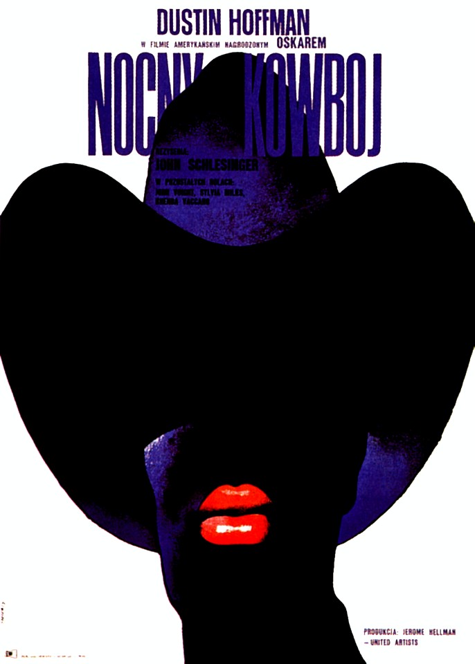
‘The birds’ by Bronislaw Zelek / ‘Midnight cowboy’ by Waldemar Swierzy
A good Polish film poster (hereafter referred to as PFP) can stand alone as an artistic illustration, and doesn’t necessarily need to have a film to promote at all. Which is in contrast to how Hollywood does it, where a movie poster is an advertisement and little else. It kinda reinforces my thoughts as to why I dislike Hollywood, as really, ever since the end of the ‘New Hollywood‘ era, which went from the mid-Sixties up to the early Eighties, the movie industry is less about promoting creativity and artistic uniqueness, and much more about how much money they can make. There’s a post I’m periodically working on about the difference between movies and films, but that’s for another time. Unless I’ve finished it, in which case, I’ll replace this very line with a link to it!
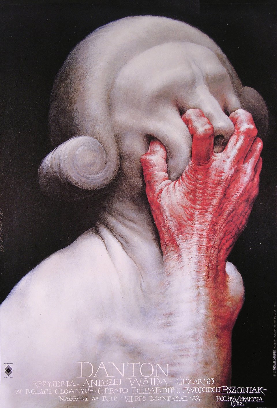
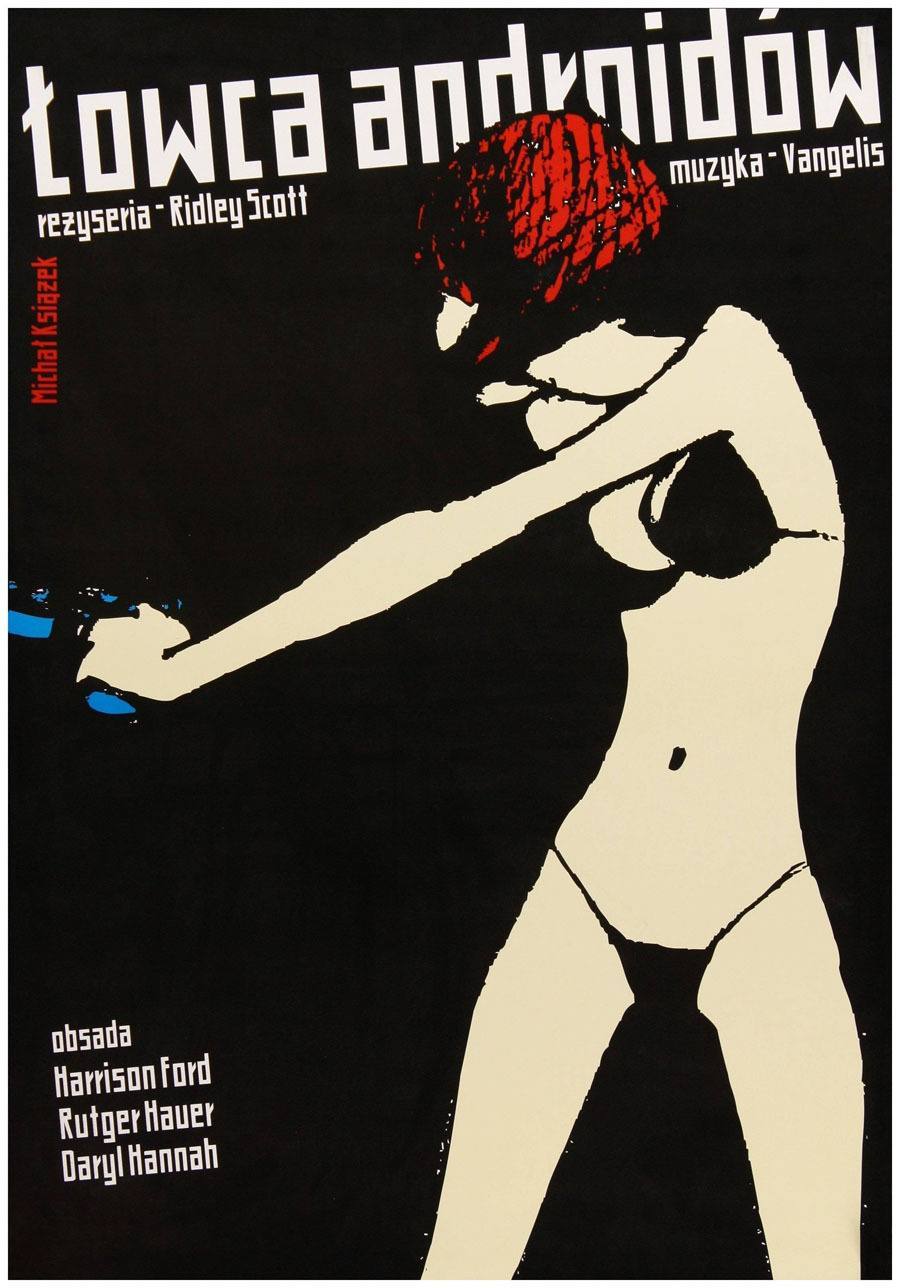
‘Danton’ by Wiesław Wałkuski / ‘Blade runner’ by Michał Książek
The main characteristic for over half of the PFPs I’ve run across is that they’re opaque and somewhat cryptic. First time I saw the one for ‘Danton’, which I believe was the first PFP I’d ever seen, I had no idea what I was looking at, and it was, and still is, incredibly startling. To this day, it remains my go-to example of a typical PFP. But the first time I saw it, I was like, ‘so I guess “Danton” is a horror film?’ It is not! It’s a period piece from 1983 starring Gérard Depardieu about Georges Danton during France’s Reign of Terror in 1794. But if you had no clue beforehand about the film’s premise, you certainly wouldn’t get that from seeing that Beksiński-esque nightmare. This stands in contrast to the Hollywood approach, which is Keep It Simple Stupid.
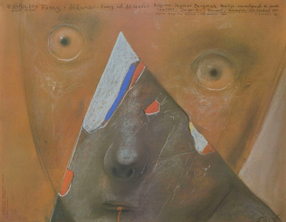
‘Fanny and Alexander’ by Stasys Eidrigevicius
I also really dig how they don’t follow conventional Hollywood Movie Poster Layout models, either. As mentioned, I loathe the meat grinder that is Hollywood, but can you blame me? Setting aside the blandness of the movies themselves, if you take a look at the posters used to promote their product, they are soulless (in a bad way) and boilerplate as hell. This 2013 post on The Wrap really lays out how bleak Hollywood’s approach to movie poster design has been for the past couple of decades, and it’s Not Good. Whereas a PFP inevitably draws you in through its vagueness and mystery… your interest is piqued, and you’re like ‘what’s this about?’ Granted, the vagueness can possibly backfire, as you could be expecting one thing and getting something else entirely; for example, you could be someone in Gdańsk in 1983 wanting to go see ‘Danton’ cos you’re in the mood for a scary film that evening. One thing is for certain, though; with the majority of the designs for PFPs, you’ll find they stick with you as arresting individual images, whether or not you’ve seen the film.
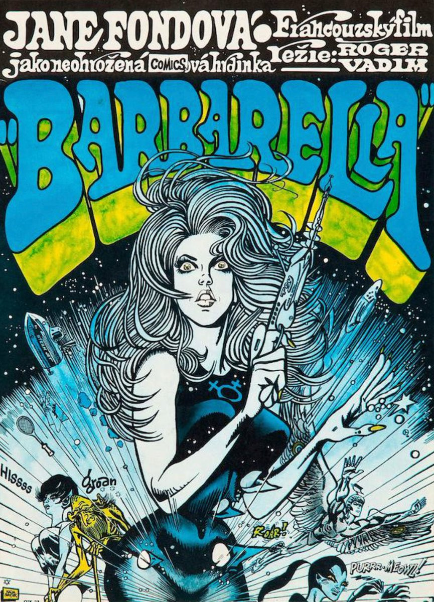
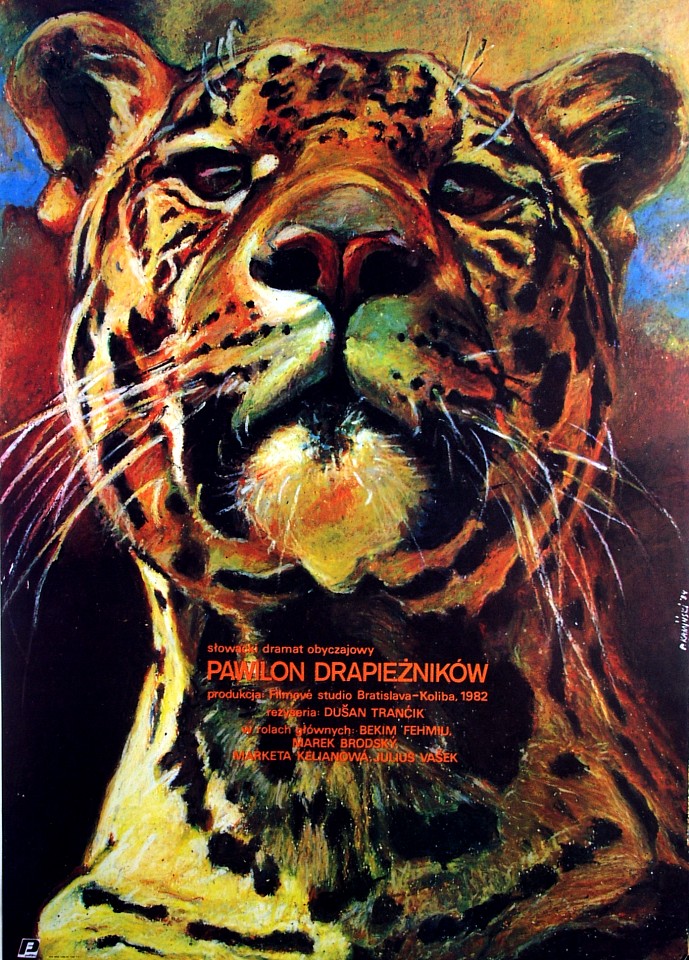
‘Barbarella’ by Kaja Saudek / ‘Predators pavilion’ by Pawel Kaminski
Going back to what I’ve said about Hollywood movie posters being adverts first, art maybe; sure, adverts have the potential to be cool and memorable; you need only check out the work of Saul & Elaine Bass or Paul Rand, among several others, to see that. However, when the posters all look the same, as you’d seen in the link to that article on The Wrap, it’s literally a case of you’ve seen one, you’ve seen them all. There’s almost zero creativity with movie posters from Hollywood, as they’re merely adverts to try to draw you and thousands of others like you into the theatre, to make some measure of profit on the millions of dollars sunk into whatever blockbuster the studios bolted together. As they’re merely adverts, there’s no effort to create them as something that can stand alone from the film it’s promoting as its own piece of artwork. There are always exceptions, but something like the couple of posters that Vasilis Marmatakis put together for Yorgos Lanthimos’ 2023 film ‘Poor things’ ain’t the rule, either poster-wise or film-wise. (Go watch ‘Poor things’, if you’ve not seen it already, as it’s a wild ride, Mr Toad.)
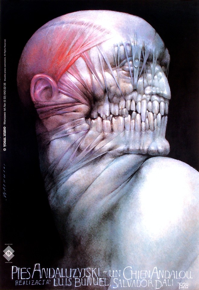
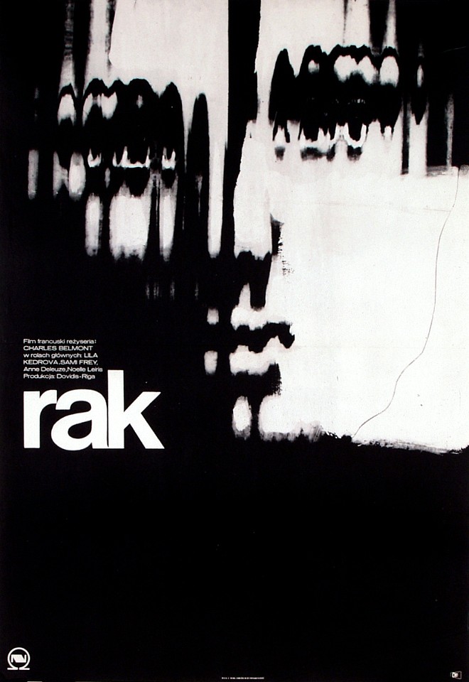
‘Un chien Andalou’ by Wiesław Wałkuski / ‘Cancer’ by Marek Freudenreich
It’s true that while they’re still advertisments, there are many who believe PFPs are much closer to ‘art’ than ‘product’. There’s a pair of aesthetically-groundbreaking identical twins by the names of Stephen and Timothy who are definitely artistically-minded film directors, as opposed to movie makers; you may know them as the Brothers Quay. Working mostly from their London-based Koninck Studios since 1979, they’ve made two feature-length films, worked on several music videos and telly adverts, and created close to forty short films, both stop-motion and live-action. But the thing they’ve often stated that really opened their eyes to unusual artistic viewpoints was, yes, the Polish film poster.
Legend has it that on their very first day at the Philadelphia College of Art—where they were studying illustration—they walked into an exhibition of Polish poster art that changed their life (though the invaluable catalogue to the exhibition dates the show two years after they matriculated, in April 1967). According to Ron Magliozzi, the curator of the MoMA exhibition, “it wasn’t simply the radical design…or the posters’ revelation of a foreign world of European opera, drama, music, and cinema that irresistibly attracted them—it was the fact that the posters spoke so freely of their subjects, as if consuming them.” It was “illustration art with the courage to be strange and ambiguous,” an idea which would strongly affect the budding illustrators.
And there’s a direct line from those posters that leads to the design language used by one of my favourite bands, Broadcast, as engineered by graphic designer Julian House; it’s blatantly apparent in the art of their second album, Haha sound.
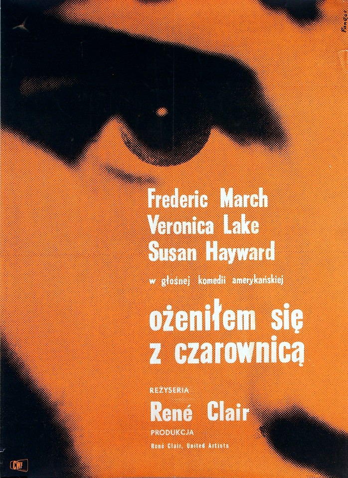
‘Big sentiments make for good sports’ by Zygmunt Zaradkiewicz / ‘I married a witch’ by Wojciech Fangor
If there’s one thing you’ve learned about today, you’re now aware of Polish film posters; your aesthetic knowledge is expanded a bit more than it was yesterday. Unless you already knew about them, in which case, you’re ahead of the game! But what you’ve seen in this post isn’t even a fraction of the ones that are out there — they’re still being made, cos for one, Poland still exists. You also get the impression that since there’s been an upswing in interest in the past decade, particularly outside of the country, that the artists there are like ‘let’s get back to it, lads! THIS IS OUR TIME TO SHINE’, or similar. But you can see loads of them at either polishposter.com or Polish Poster Gallery; other online shops exist, of course. Plenty of prints are even for sale! Although I kinda have my eye on this Stanley Kubrick triptych, but I need to consider where I can put it, so until then, no-one’s allowed to buy it in the meantime
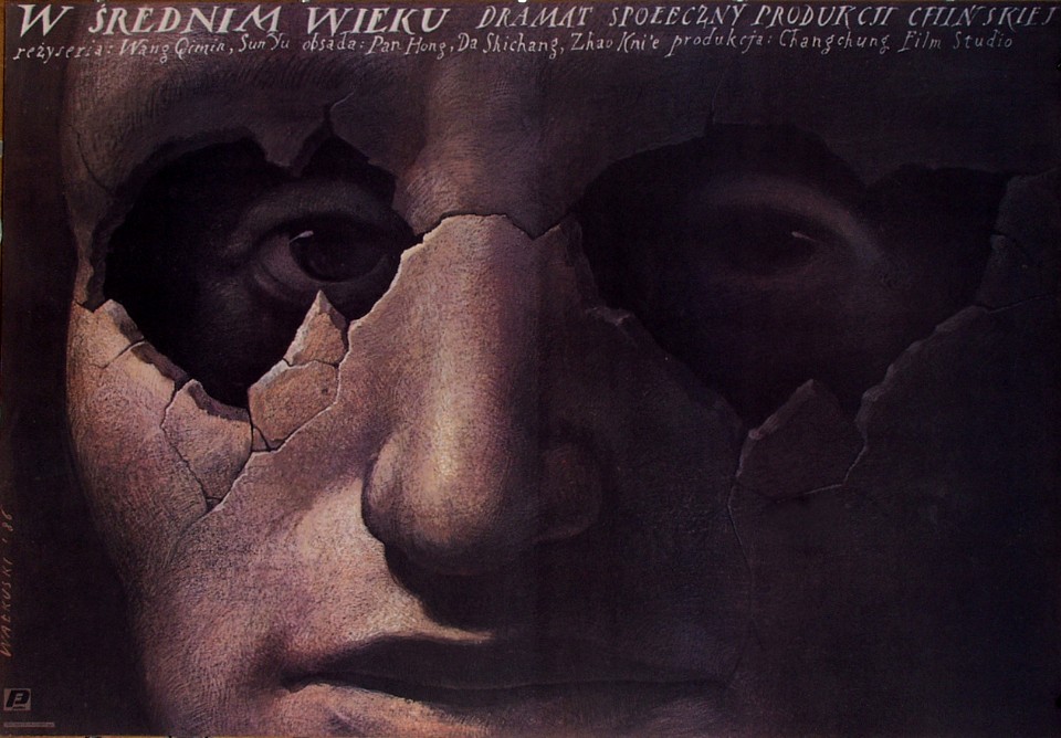
‘In the middle age’ by by Wiesław Wałkuski
Random similar posts, for more timewasting:
Less of a Galerie, more of a hall of mirrors on June 8th, 2019
Any Synthetiks-related news, Davecat? (Jan 2015) on January 25th, 2015

June 23rd, 2025 at 1.29 pm
Sill reading this through Davecat, but “Random similar posts, for more timewasting:” is completely brilliant. It reminds me that I need to keep up with the trigger warning on long text posts that there are words, lots of word one can read.
Keep going,
Em
June 23rd, 2025 at 3.03 pm
One of the axioms I adhere to for quite a few things was taught to me (not personally) by one of my heroes, Andy Warhol, who once said ‘Always leave them wanting less’. 🙂
I’ve always been verbose — just ask my Missus! — but I think, especially in terms of my most recent posts, they’ve been a reaction to the 280-character limit that social media has. Verbosity is good! It makes people stop and think! It’s the difference between an actual meal, versus cramming a granola bar into your gob and calling it dinner! Plus, I look at them as a filter: if my writing volume is too much to handle for a person, then they and I might not be suited for effective communication.
READING: It’s Fun and Mental!