


Looking backwards is looking forwards
typed for your pleasure on 23 February 2013, at 10.35 amSdtrk: ‘Black holes are not completely black’ by Leyland Kirby
If there’s one thing I can be accused of indulging too much in, it’s artifice. Frankly I’ve no clue as to where people get that notion, but whatever. The other main attraction in my life would of course be design from the late Fifties to early Seventies. As the oft-neglected ‘This was the Future‘ series shows, I’m fond of architectural examples from that period, but I love the design as well. So it makes sense that I’m digging the hell out of graphic designer Julian Montague’s work.
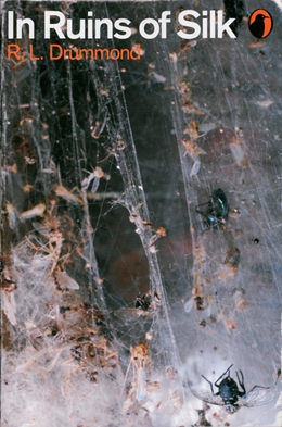

Not only are his pieces arranged with exacting detail — the book covers alone are like a loveletter to the Marber grid, a design template that came to fame via Penguin’s paperback covers during the Sixties — but every title and every name used are completely affictitious.

In looking over his imagined covers, he seems to have a fascination with insects, particularly spiders. I don’t know what that says. Maybe set out more traps?
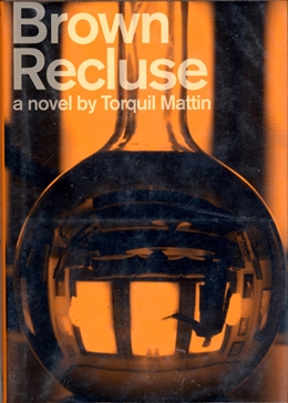
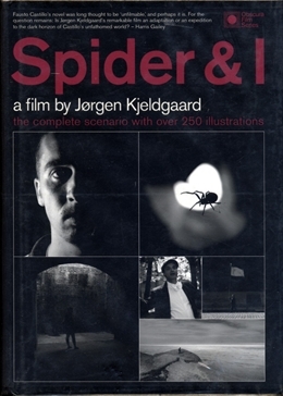
Not only does Julian’s work blur the lines between art and graphic design, but it also distorts things both real and imagined. We need more people like him! Go see the full website here, and Happy 23rd!
Random similar posts, for more timewasting:
The Eighties are back! And THEY'RE COMING FOR YOUR EARS on February 6th, 2010
A grand idea / 'Oh toh toh toh' / It's on the 11th on December 11th, 2005